 In this magazine cover we have the logo and the band name which are the only texts which are in colour and in big bold print. The band are also placed in the centre of the magazine cover as this issue is based around them. We have the only female member called "Hayley Williams" placed at the front of the magazine and the "Paramore" sign is in pink to attract the female audience aswell as the male.
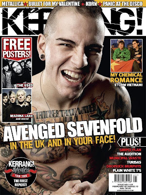
Here we have "Matthew Sanders" who is the lead singer and front man of the band "Avenged Sevenfold". His face and naked upper body is shown (instead of featuring all of the band members) which is used for sex appeal, as his looks would attract many of the female audience making them want to buy this magazine issue and therefore allowing Kerrang to gain more money.

Another element (other than the bold writing and pictures of the band members topless) is the advertisements also featured around this. Here we have pictures of other bands and artists of the same genre such as "Paramore", "Metallica" and "The All- Americn Rejects" so this magazine cover would not only attract Green Day fans but other fans too which is another big selling point.
None of these are adverts for the artists. The reason we ask you to do this research is because you will be designing an ad for your artist. Not a cover. There are different conventions at play in advertisements than the covers of music magazines. You will need to redo this entry I'm afraid.
ReplyDelete